In “Two Book Cover Possibilities–Which Do You Like?” I invited you to vote for your favorite cover design for my young adult dystopian novel The Devil Particle. The results are in and we have a winner! Before I reveal the official cover, I’d like to tell you how I got to this point.
My first step was to hire professional book cover designer Patrick Knowles (see “I’ve Hired a Book Cover Designer”). I sent Patrick a synopsis of the book which included this logline:
In The Devil Particle, scientists have discovered that evil is a known quantity that can be collected and contained, but the vessel they use has to be a teenager.
Then I told him my ideas for the cover:
At first, I pictured a young man . . . arms outstretched, head bowed, with something like an atom looming over his head . . . But I’m not sure I like this idea any more, particularly since the covers of other dystopian books tend to be more symbolic and less literal. Being so literal seems a bit amateurish.
This was Patrick’s reply:
I think it’s really helpful to look at all aspects as you never know what might jump out as a possible lead. Sometimes a strong idea just hits you, other times you have to try out different routes to see what works. So don’t worry about being literal, it helps me to get a bit of an insight to what you’re hoping for.
We then met by Zoom and Patrick summed up our meeting:
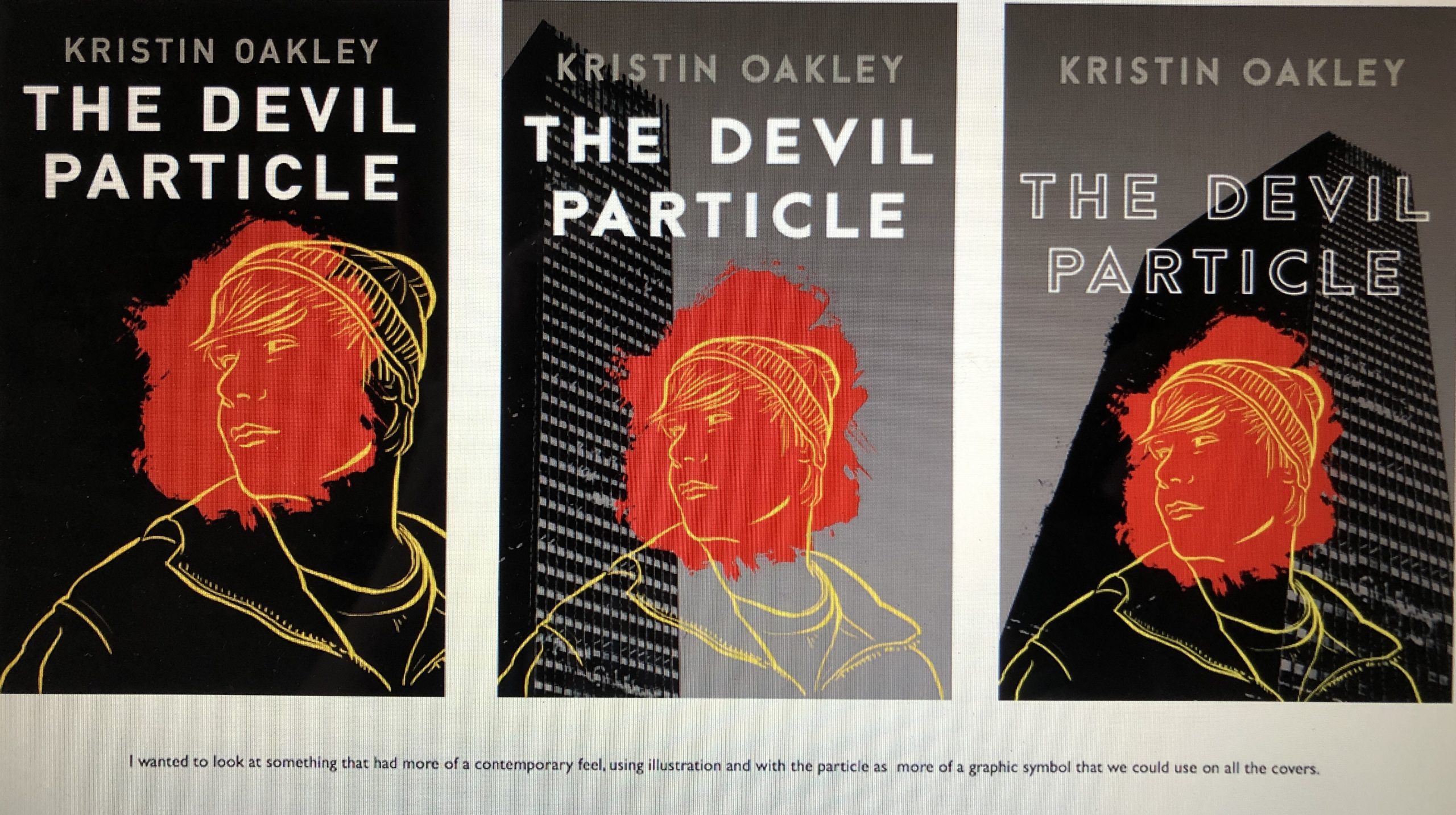
. . . I suggested we use the classic Hunger Games/Divergent ‘logo’ approach as a starting point . . ., but then showed images of Malorie Blackman’s books which had the illustrated figures as a possible route as well. So I’ll use these two basic approaches as the starting point for initial ideas and then we can see how it could possibly progress from there.
We also discussed possibly showing the Devil Particle represented as some kind of graphic image or symbol, and possibly indicate in some way the battle between good and evil.
I then sent Patrick information about the book’s settings like the abandoned skyscraper and included photos of real atoms. Next, I went to Barnes & Noble and photographed covers of books by Tracy Wolff, Heidi Perks, Tom Rosenstiel, Claire Holroyde, and James Dashner which I liked for various reasons. I passed those along to Patrick.
I shared other ideas with him such as including a wristband on the cover. In The Devil Particle, Vessel Trial Competitors have to wear a wristband similar to a FitBit.
Here are Patrick’s initial designs:
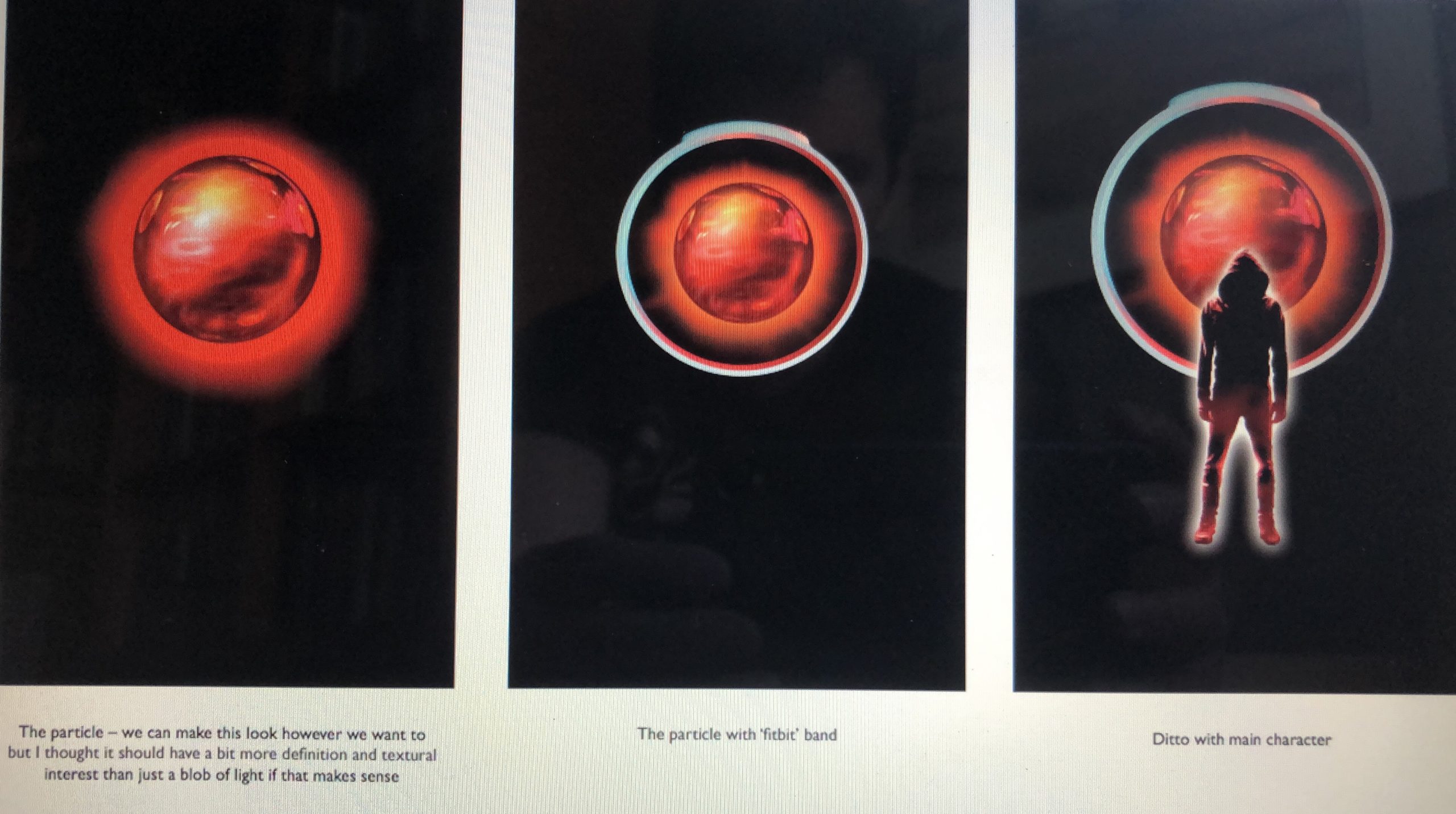
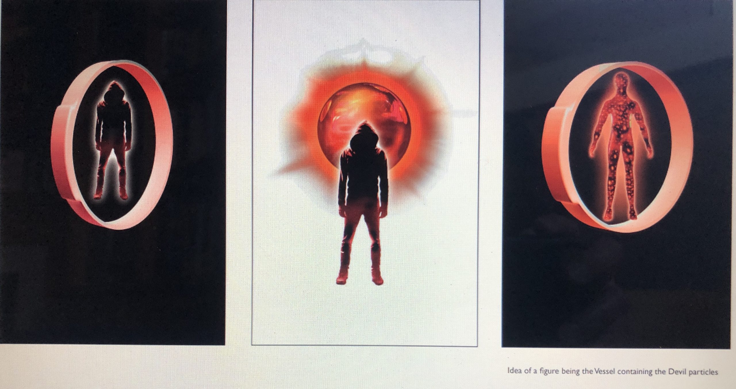
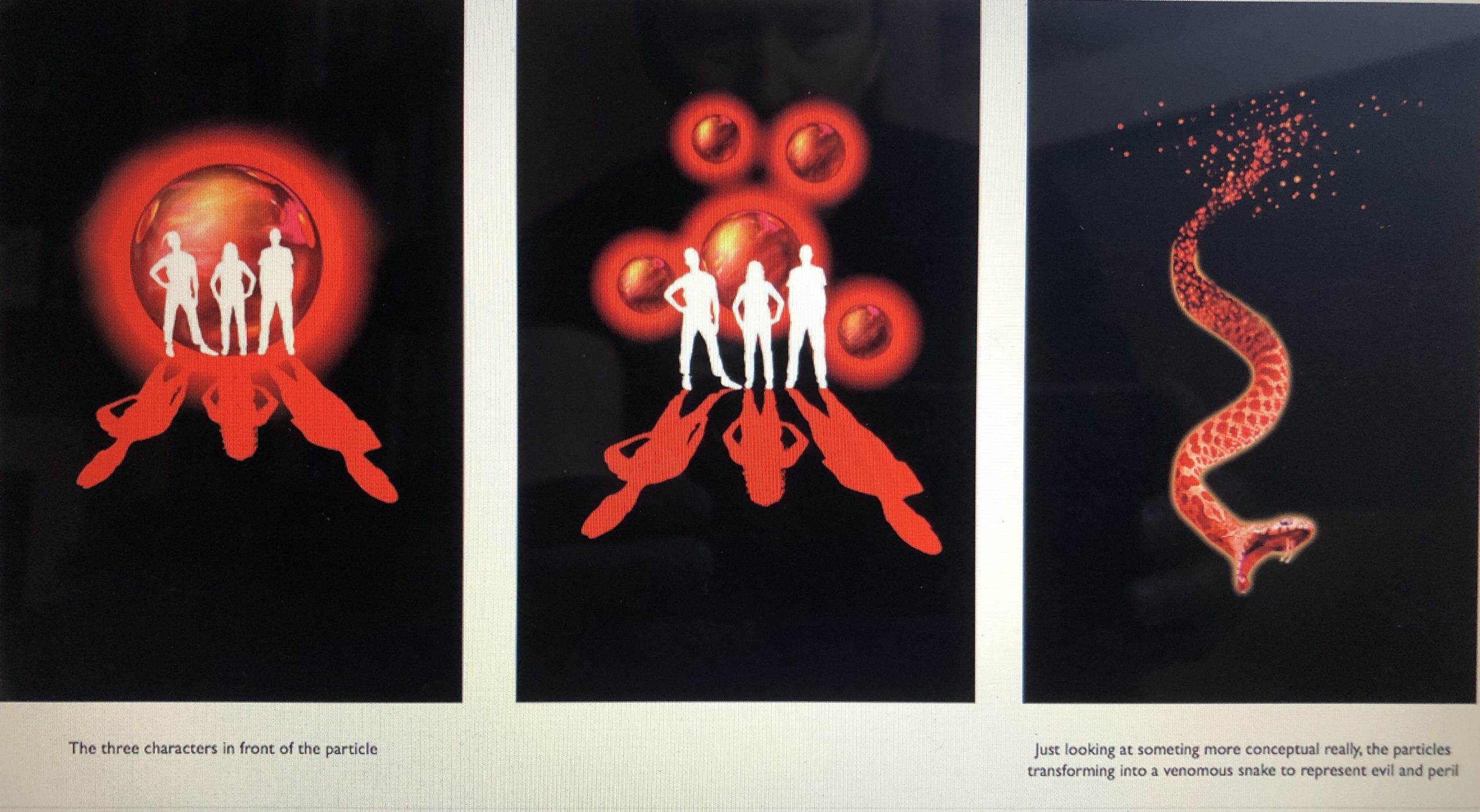
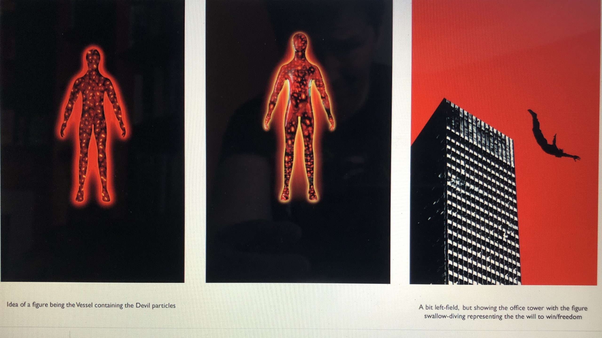
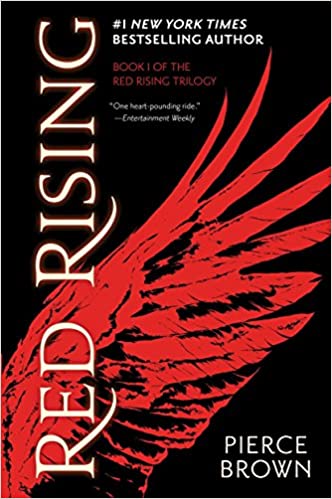
I told him my favorite was the one with the white background because of the menacing figure. We set up another meeting and I sent him more book covers including this cover of Pierce Brown’s bestseller Red Rising:
Patrick summed up our second meeting by saying:
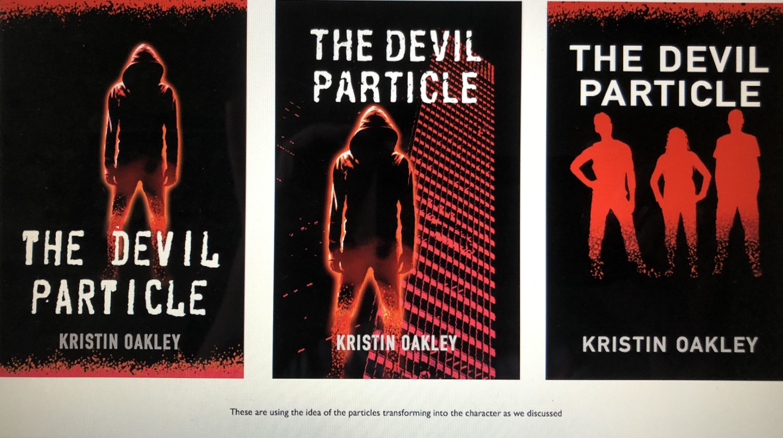
. . . The best way forward would be to focus on a figure or group of figures . . . We discussed the possibility of showing one of the figures changing from particles into a figure, a little along the lines of the snake image I created in the first round.
We also discussed using body language as a graphic device for each book, so running up stairs . . .
Will also look at potential backgrounds behind the figure silhouettes – the tower block . . .
And will look at the lettering for the title on the next round. It could be that a more type-lead so that the lettering becomes more the focus possibly. Will try to use some kind of graphic to hint at the particle within the lettering, using the dot above the ‘i’ for example.
Then Patrick sent me his second round of designs:
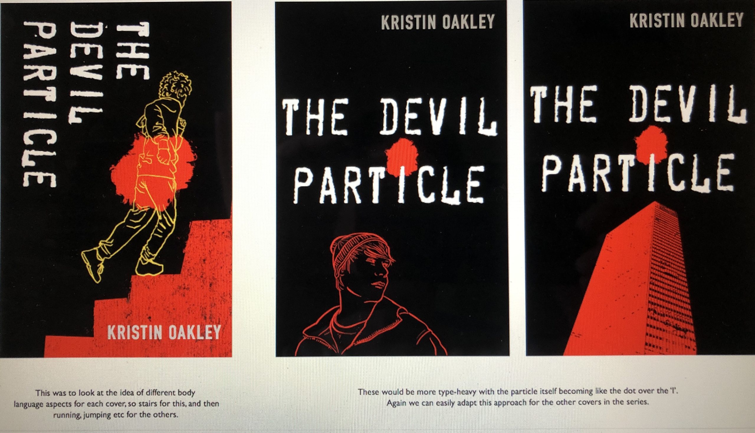
I gave Patrick further feedback including, “Instead of an actual particle to dot the ‘i’, we could make the word ‘particle’ red” and “I prefer the stairs to the skyscraper — it’s more action-oriented.”
Patrick asked me for some phrases to possibly include on the cover so I threw these out:
What will it cost to become the world’s savior?
What will it cost to save the world?
Who will become evil’s vessel?
Then he sent me these designs:
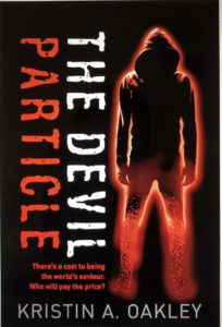


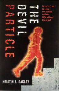
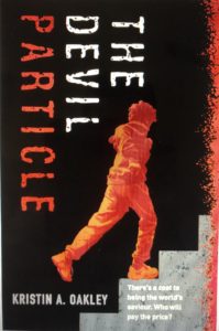
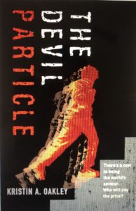
After a little more tweaking, we came up with these two choices which I included in “Two Book Cover Possibilities–Which Do You Like?”:
Choice A

Choice B

In response to my newsletter, I received feedback from 59 adults ages 26 to 94 the majority of which were between 50 and 60 years old. Cover A received 36 votes. Cover B received 23. I also asked people if they liked the word “but” in the phrasing — “There’s a cost to being the world’s savior. But who will pay the price?”. It was pretty much a draw when it came to using “But” and several people had suggestions for other wording.
Then, because my target audience is young adults ages 12-17, I thought I’d better survey teenagers. I asked two high school teachers I know to poll their students. Of the 126 teenagers polled, 55 voted for Cover A and 71 voted for Cover B. That put Cover B slightly ahead.
I asked Patrick to do some more tweaking, including switching the direction of the vertical lettering and making all the lettering white. I had him switch it back — lol!
So, big drum roll, here is the official cover of The Devil Particle:
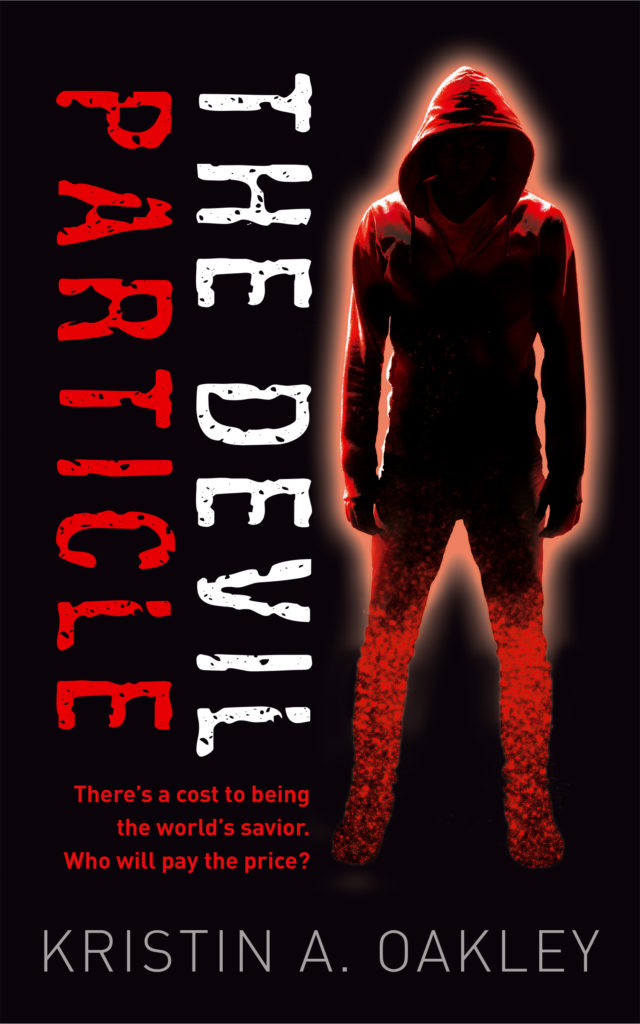
I love the menacing character and how he’s at odds with the title. I think it sets the right tone for this book and the whole four-book Devil Particle series.
Thank you for your votes and valuable input! I hope you had as much fun with this as I did!
This month’s book:

The Parable of the Sower by Octavia E. Butler who was the first science-fiction writer to receive a MacArthur Fellowship. Fifteen-year-old Lauren Olamina struggles to survive in a futuristic California where violence is rampant because of climate change and economic instability. What must she do to keep herself and her family alive? This New York Times Bestseller was written in 1993 and takes place in 2024 — yikes!
What’s happening in May:

I’m finishing the first draft of The Renegade — the fourth book in The Devil Particle Series! I’ve written 55,000ish words (220 pages) and have about 20,000 words to go. I’ve been doing a lot of work on the book’s structure and am still hopeful I’ll complete this first by the end of May. I thought maybe there’d be a five book, it’s still a possibility, but now I don’t think so.






Very nice cover, Kristin! Congratulations!
Thank you, Sharon! And congratulations on the publication of your latest poem in The Stray Branch Magazine. I also loved the YouTube production of the narration of your poem “The Moon is Full” with an original score–so beautiful!
Kristin
Great cover, Kristin! I enjoyed reading about your journey toward the final product with the artist.
Thank you, Peggy. I’m so glad you enjoyed it! I’ll probably do another article on copyediting/proofreading when we get to that point if you’re okay with that. Just let me know.
Kristin
I love the book cover process! Thanks for the behind the scenes information. Great idea to ask high schoolers their opinion. Looking forward to your progress.
Thanks, Lisa. It was a terrific experience working with Patrick and I’m excited to be working with him on the other three books in the series. I’ll be sure to keep you posted!
Kristin
Great update, Kristin! Loved reading the “cover story” and how you moved from concept to final choice. Now I’m even more anxious to read it! 📚
Thank you, Dana!
Thanks for the explanation of the steps in your cover design. Great info for those who may one day need to design a cover for their own book.
You’re welcome, Lisa. I’m so glad you found my article beneficial.
All the best,
Kristin
I really like it.
It’s nice of you to share how you got there. Gives others ideas on how this process can happen.
Thanks, Christine!
Awesome process. Bravo on the cover!
Thank you, Kate! Looking forward to seeing your book cover, too!
LOVE the cover! Such a great illustration of your process too!
Thanks Shannon! I can’t wait to see the cover for your book!