As I mentioned in a recent newsletter (“I’ve Hired a Book Designer”), I’ve been working with highly-acclaimed book designer Patrick Knowles to create the cover for my soon-to-be-released book The Devil Particle. Next month, I’ll tell you about the process behind creating the designs, but now I’d like your help selecting the cover.
Before you decide which cover you like, I’ll tell you a bit more about the book. The Devil Particle is a young adult dystopian novel (also known as a near-future thriller). In The Devil Particle, scientists have discovered that evil is a known quantity that can be collected and contained, but the vessel they use has to be a teenager. Teenagers from all over the country volunteer to compete in the Vessel Trials. The winner will become the Vessel, containing of all the world’s evil and perhaps saving humanity.
Generally speaking, young adult dystopian book covers tend to have dark colors and brooding characters or unusual symbols and often a ruined cityscape (check out the covers of The Hunger Games, The Fifth Wave, and Divergent). They don’t have pink and blue pastels or a couple holding hands like on teen romance covers, or the bright colors and sketchy fonts of teen literary fiction (see Red, Royal and Blue and The Fault in Our Stars).
Most importantly, a cover has to be intriguing enough to grab the reader’s attention and interest. I’ll pick up a book simply because of its beautiful cover, no matter the genre.
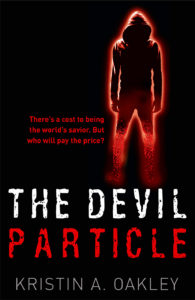
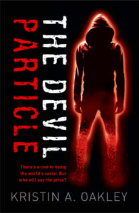
So, I’ve narrowed Patrick’s designs for The Devil Particle down to my two favorites. And I have two favors to ask. First, tell me which cover design you like — “A” or “B”. Does the design grab you? Intrigue you? Give you a certain vibe? Okay, here we go:
Choice A
Choice B
Second, which blurb do you like better:
Choice C
There’s a cost to being the world’s savior. But who will pay the price?
Choice D
There’s a cost to being the world’s savior. Who will pay the price?
Be sure to let me know which cover and which blurb (with or without the “But”) you prefer!
Next month, I’ll let you know who the winner is and reveal the final cover. I’ll also tell you all about process behind designing this cover.
Thank you for your help!
What’s happening in April

Throughout April I’m writing The Renegade — the fourth book in The Devil Particle Series. I’ve written 38,607 words (147 pages), which is about halfway. I don’t know if I’ll finish this first draft in April, but I’m gonna try.


I like B for cover, C for blurb. The cover looks dark and brooding, gives a heavy vibe. Almost devil-like. If that’s what you’re going for then you’ve succeeded! I look forward to seeing the finished product.
Devil-like is exactly what I’m going for — thank you Lisa!
Congrats on being so close to getting this book in the hands of your fans! I’ve sent you my choices and can’t wait to hear the final result.
Thank you Lisa!
A&D
Thank you, Mike!
I like A and C. But I’d also suggest giving the “C text” a brighter color that stands out more. Hard to read at this size, so it’ll be impossible in thumbnail size. But what do I know about cover design? Good luck with whatever you go with.
Thanks, Chris!
B and D
Thank you Paul!
Book cover A, blurb D
Thank you, Penny!
Choice:
B & C
Congrats on your new book!
Thank you, Bob!
A and C; though there should be a semicolon before the word but.
Thank you, Bev!
Cover “B” I like the close-up image better. Choice “C” blurb. The word BUT makes more of an impact for me. You know there’s danger ahead and can’t wait to find out more.
Thank you, Carol! Hope to see you soon.
I’d go with A and D.
Thank you, Sandra!
I vote for Choice A and D. Love the cover!
Thank you, Sheri!
Choice B and Choice D
I liked the hooded figure being right up front and in my face.
I like the directness of:
Who will pay the price? No buts about it.
Congratulations. Your book sounds intriguing.
Thank you, Rose!
Thank you, Rose!
I was sorry to hear you hurt yourself right before the CWA conference and was unable to come. I hope you’re doing well. I’ll see you at the conference next year!!
A & C
Thank you, Corina!
Hey Kristin,
I like cover B.
“But” doesn’t seem quite right, but the other one doesn’t have the right rhythm. Does “So who will pay the price” work?
Hey Christine: I thought the rhythm was a little off, too. I’ll consider your suggestion. Thank you! Kristin
Choice A and D. So proud of you!
Thank you, Holly, that means a lot to me! 🙂
A & C
I liked the cover of B as well, but my eyes were trying to focus in too many places.
Good to know, Juliann, thank you!
My choices are: A and C.
Thank you,Sheila!
Both are brilliant, my dear friend. I’d go with “A” I read the title quicker and, for me, the figure is more menacing further back.
Thank you, Nick!
A and D
Terrific plot! Love the concept
Thank you, Patricia!