I’m currently formatting The Vessel – the second book in The Devil Particle Series, and am on track to release it later this fall. So exciting! For those of you who received an advanced reader copy (ARC) of The Devil Particle or bought a copy, you’ve had a sneak preview of The Vessel‘s cover (hint, check the back of the book). For everyone else, here is the cover:
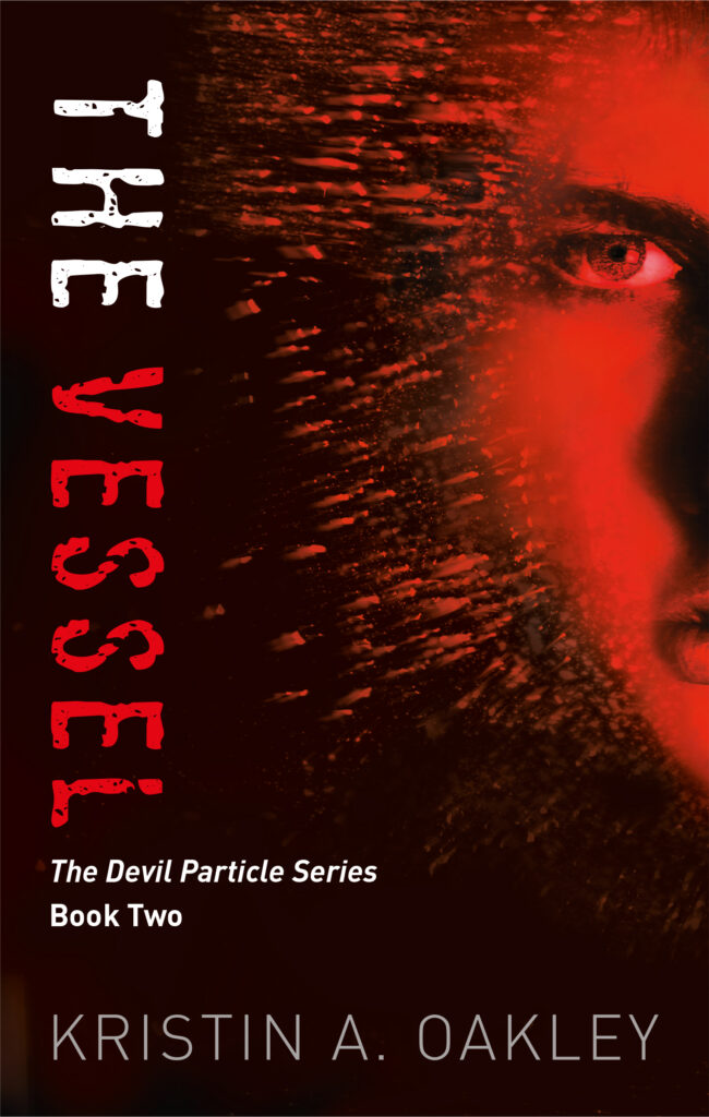
I love that the agonistons (devil particles) bombard the character on this cover. It’s so dynamic. And the character is exactly how I pictured them. Many thanks to cover designer Patrick Knowles for designing this cover and all the covers in The Devil Particle Series.
Patrick and I have been working on the cover for the third book, The Runner, and I don’t think it’s quite there yet. Here’s the latest design:

And to put it in context with the other two books, here are all three books together:
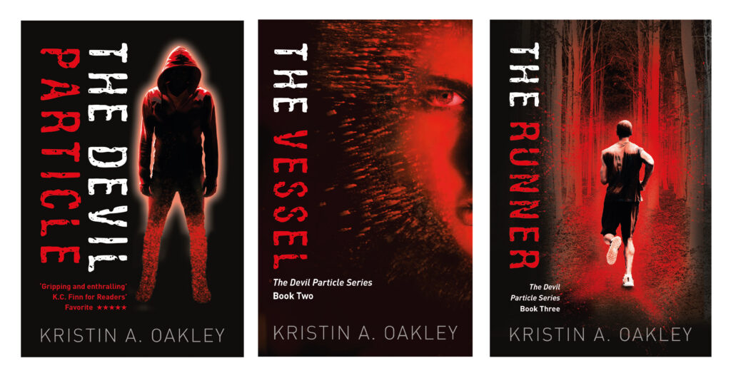
What do you think? What do you like about it? Is there anything you’d change? Please send me your thoughts and suggestions. Your feedback will be a terrific help! Thank you!
Upcoming Events
 Thursday, August 3rd – Join award-winning author Abigail Morrison and me from 6:00 p.m. to 7:30 p.m. at Martha Merrell’s Books, 231 West Main Street, Waukesha, WI.
We’ll talk about all things writing, answer your questions, and sign books. Refreshments will be served. This is a free event, but you do have to register.

Saturday, September 9th, from 9:30 a.m. until noon – I’m back under the Chicago Writers Association tent at the Printers Row Lit Fest in downtown Chicago signing books. Hope to see you there!





My suggestion for the third cover would be to make the runner much bigger, almost taking over the frame and offset to the right just as in book #2 – the version now kind of emphasizes the trees but I’m thinking the fact he’s running is the important part. And maybe a bit “futuristic” in a design element like the first two. Make his muscles, back, shoulders prominent – don’t probably need anything from the waste down. My 2 cents.
Thanks, Maggie, good suggestions! I’ll pass them along to Patrick.
I think both covers are spot on, Kristin. I wouldn’t change a thing.
Thanks, Larry. It’s good to know we’re definitely on the right track!
Kristin
The writing “The Devil Particle Book Series
Book Three
>Make it identical to that on the Book Two cover (larger and clearer). To make space move the runner up and bigger (as Maggie says) and then that writing can be on the black background.
Okay, thanks so much, Mike!
The second book cover is another stunner! For the third one, I’d go with Maggie’s comment – except that I do think you need to see his legs running. You are definitely on a roll – great momentum with the timing of the series!
Thanks, Kate!
Having read the first book, I do have some background. Looking at the cover for book 2 of the series, I didn’t understand that those little lines we Devil particles hitting his face. I am glad you mentioned that in this newsletter. At first, I thought it was hair and that he now looked like a wolfman. Like the third cover, just wondered where he was running to, and someone mentioned trees in the comments. Can’t wait to read book 2.
Thanks for your input, Lorraine!
Love the covers for the first two books! I am thinking that The Runner needs some more energy, more focus-you had some other great suggestions. Maybe a diagonal tilt or a view that will engage the reader with the character and the action. Thank you for letting us comment.
Hi Emily,
These are terrific suggestions–thank you! My cover designer took new action pictures (fun fact, the model is his son) and sent me four to select from. They’re terrific. I picked one and am waiting for the results. I’ll keep you posted.
Have a great weekend,
Kristin