Wait, what? Hasn’t Carpe Diem, Illinois been out for a while? Yes, it has. Ten years, in fact! To celebrate, I’m releasing a tenth-anniversary edition with a new cover and an author’s note. I’m also writing a short (ten-page or so) prequel to the series which I’ll be happy to share with you.
Okay, so here we go . . .
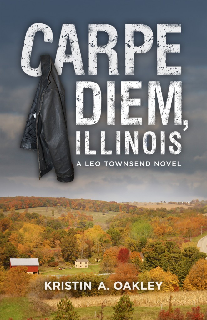
The Original Cover
 The original cover of Carpe Diem, Illinois is beautiful. It was designed by the talented Kristin Mitchell of Little Creek Press. I’ve received many compliments about it, and several people have said they bought the book based on the cover.
But over the last ten years, I’ve learned that beauty isn’t the only thing covers need. According to self-publishing giant IngramSpark, a book’s cover should:
- Give readers a sneak peek of what’s to come.
- Let the reader know the book’s genre.
- Introduce your protagonist.
- Set the right tone.
- Follow the rules of design in a way that makes sense for your genre.
- Pay attention to the details.
- Have a distinct style.
The original cover possibly introduces the reader to the protagonist — his jacket and name are on the cover, after all. It also sets a slightly ominous tone and has a distinct style. But, what would you say is the book’s genre? Mystery, perhaps? Maybe a cozy mystery?
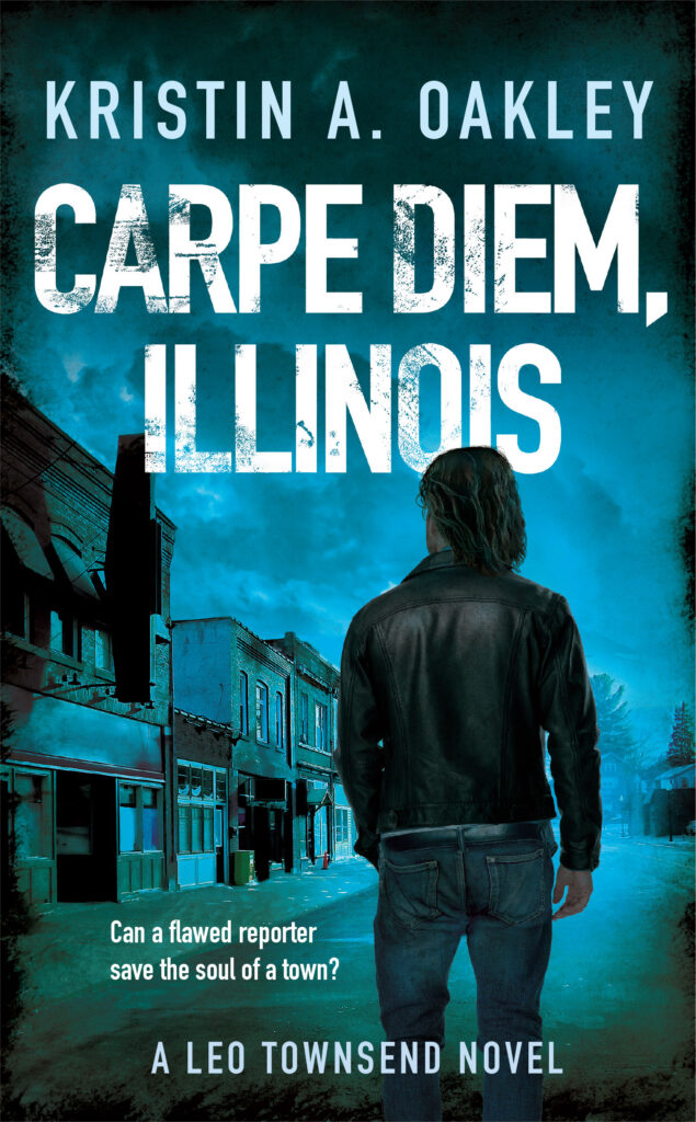
The Tenth Anniversary Cover
For the new cover, I hired Patrick Knowles of Reedsy. Patrick designed the covers of my current Devil Particle Series and has a vast wealth of expertise in creating genre-specific covers. When we first talked, I told him I liked the original hanging jacket and color scheme. He told me I’d have to let go of those things to make the new one a success. But he promised he’d hang the jacket on the back.
The new design took some getting used to — it’s so different and I’d lived with the original for over ten years. But, it ticks off all seven of those necessary design elements and I love its intensity. Can you tell what genre this book is?

Release Date
I plan on releasing the tenth-anniversary edition of Carpe Diem, Illinois in the next few weeks and will let you know as soon as it goes on sale (for a discounted price). In the meantime, let me know what you think of the new cover!


Much improved. I must admit that when I learned your first book was a mystery/suspense, I was confused because I rembered the cover and had thought it was more of a literary, slice-of-life novel. This one makes far more sense plus in some ways, it resembles your Particle series. Good job, Patrick, and pat on the back to you, Kirstin, for being willing to try something different now that you’re a more experienced writer.
Thank you, Maggie!
I love it!! But I know how hard it must be to get used to a new cover!! Great job with this.
Thanks, Valerie!
I love the new cover! It’s dark and broody.
Ooo, just what I’m going for — thanks, Deborah!
One of my favorite books!
That’s so good to hear! Thank you, Carol!
I like it! Keep that cover designer on retainer. 😉 Original was good. This one is better.
Thanks, Chris. Yep, I’m putting Patrick’s kids through college, lol.
I dunno. I liked the first one a lot. The sky brooding over the little town. It’s true the new cover has those elements, too, but it’s so much darker. I don’t remember the plot of Carpe Diem, Illinois being quite so dark.
The new cover has a lot of depth and design dynamics for sure. I’m not sure what the genre is, though, from either cover. That may be my own ignorance of genres.
Hi Larry,
Thanks so much for your input. There is murder and mayhem in Carpe Diem, Illinois — it definitely has dark elements, though not as dark as my current series. The genre is mystery/suspense/thriller and the new cover is more typical of suspense thriller novels.
Kristin
Love Carpe Diem and the follow-up: God on Mayhem Street. I’m eagerly waiting for the next Leo Townsend book.
Thank you, Lisa. Leo’s waiting, too. Hopefully, he’ll make an appearance in 2026. 🙂